


.png)
The difference between responsive and adaptive web design
In an age of smart devices with every kind of screen size, a website that can’t present itself properly on each of those screens not only gives visitors a poor experience but also falls behind the competition. Two fundamental approaches in web design address this challenge: responsive design and adaptive design. But how exactly do they differ, and which one can be the key to your website’s success? We answer these questions below.
How do responsive and adaptive web design differ?
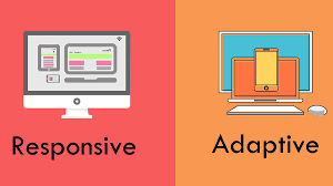
Broadly speaking, the difference between responsive and adaptive web design lies in how they deal with different screen sizes. Responsive web design uses a flexible, smart layout to adapt the site’s content and structure automatically to any screen size. Adaptive web design, on the other hand, is based on creating several separate, fixed layouts for specific groups of devices (such as desktop, tablet and mobile). In other words, an adaptive website shows each user the best pre-built layout for their type of device. Below we look at this fundamental distinction in more detail.
What is responsive design (in Persian) and why is it essential for your website?
What is responsive web design?
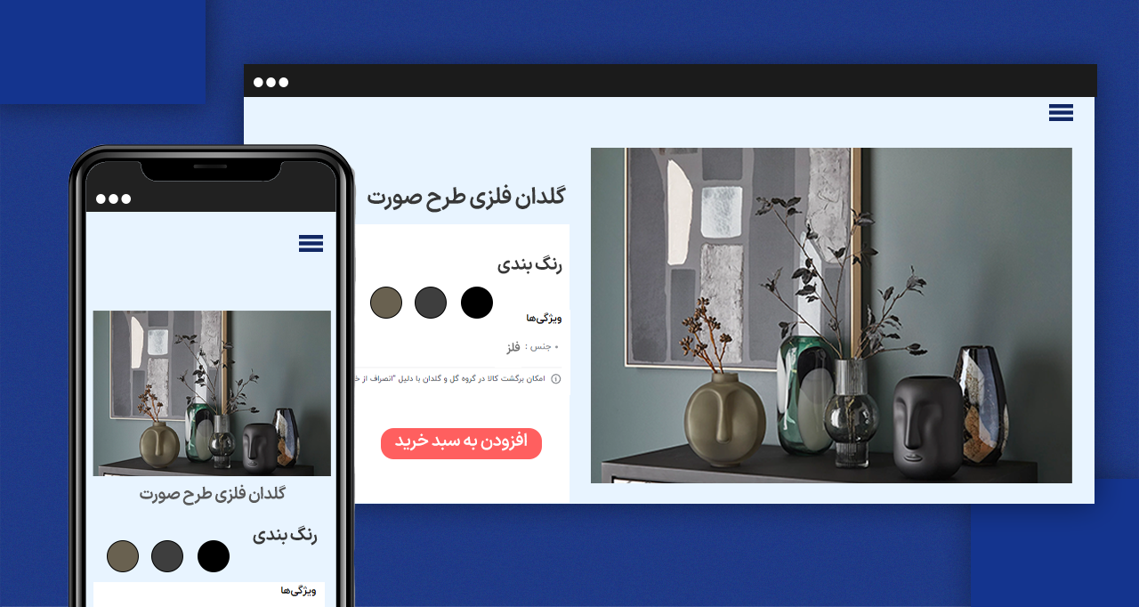
The core idea of responsive web design is a single, flexible layout that can adapt to any screen size, from the smallest phone to the largest desktop monitor. How does this happen?
- Fluid grids: at the heart of responsive design are fluid grids. Instead of setting element widths in fixed units such as pixels, relative units such as percentages are used. Columns and other page elements then shrink or grow in proportion as the screen size changes. Imagine a flexible net whose cells change size with the frame while the overall structure stays the same.
- Flexible images: images behave smartly in responsive design too. Properties such as
max-width: 100%make sure images never exceed the width of their container and scale down automatically when needed, avoiding unwanted horizontal scroll bars. - CSS media queries: this powerful CSS feature lets designers apply different styles based on device characteristics such as screen width and height, device type (screen or printer) and orientation (landscape or portrait). With media queries you can decide which arrangement and style users see at which screen size. Showing a horizontal menu on desktop and turning it into a hamburger menu on mobile is a typical example.
Pros and cons of responsive web design
Responsive web design is one of the standard, modern approaches to building websites, aimed at displaying content optimally on every device and screen size. Below we look at its advantages and disadvantages and how it affects user experience, SEO and the development process.
Advantages of responsive design
With the variety of digital devices growing every day, a website that can adapt smartly and automatically to different screen sizes and characteristics has become very important. Responsive design lets developers provide an optimal, consistent user experience across devices with just one version of the website. It not only simplifies development but also plays an important role in better SEO and user satisfaction. Let’s look at its key advantages more closely.
1. Simpler development and maintenance
In responsive design, a single codebase is used for every device. As a result:
- Development is simpler and faster
- Maintenance and update costs go down
- Any change to the site’s content or look is applied to every device at once
This unified management makes the development team more productive.
2. A better user experience on every device
Responsive design gives users the same smooth, consistent experience on any device, from phones to large monitors.
A consistent user experience can lead to:
- Longer time on site
- A lower bounce rate
- A higher conversion rate
3. Significant SEO benefits
Google and other search engines treat responsive design as an important factor in ranking search results. The reasons include:
- A single, stable URL for every version
- No redirects or separate mobile version needed
- Faster page loads on mobile (when properly optimized)
A better experience for mobile users can also indirectly improve the site’s SEO.
4. Ready for the future and for new devices
With more and more devices of different sizes and resolutions (such as smartwatches, foldable screens and smart TVs), responsive design ensures your website stays usable in the future without a complete redesign.
Disadvantages of responsive design
Despite its many advantages, responsive design isn’t without challenges. Like any technical solution, it can bring limitations in some situations that should be considered carefully before implementation. From longer load times on some devices to the complexity of designing for many screens, these drawbacks can affect the user experience and overall performance if they aren’t managed well. Here is a closer look at the most important ones.
1. Unnecessary content may be loaded
In some cases, files or images that aren’t visible at a given screen size are still loaded. This can lead to:
- Longer load times on slower devices
- More data used on limited connections
✅ Suggested solution: techniques such as lazy loading, responsive images (srcset) and resource optimization reduce the unnecessary load.
2. Complexity in design and implementation
Designing an interface that displays correctly at every size and still looks good requires:
- A highly skilled designer
- Continuous testing on different devices and browsers
- More time in the design and development phases
✅ Suggested solution: a mobile-first design approach and frameworks such as Bootstrap or Tailwind CSS can ease part of this challenge.
What is website optimization? (in Persian) How does it increase sales and traffic?
What is adaptive web design?
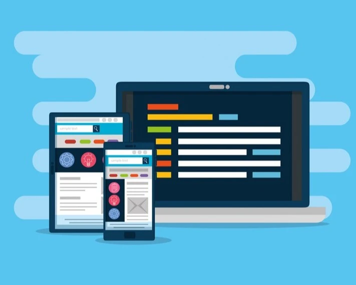
In contrast to the dynamic flexibility of responsive design, adaptive web design is based on offering several predefined versions of a website’s layout for specific groups of devices. In other words, designers create several fixed layouts for common screen sizes (such as desktop, tablet in landscape and portrait, and mobile). When a user arrives, the system detects what kind of device they’re using and shows them the best pre-designed layout for it.
- Breakpoints: adaptive design uses breakpoints to set the boundaries between screen sizes. For each defined size range (usually marked by a breakpoint), a separate layout is designed and built. For example, there might be one layout for widths above 1200 pixels (large desktops), one for widths between 768 and 1199 pixels (tablets) and another for widths below 768 pixels (phones).
- A tailored user experience: because each group of devices has its own layout, designers can optimize the user experience specifically for that type of device. For example, they can use different navigation patterns, show priority content to mobile users or use features specific to each device.
Advantages of adaptive design
Adaptive design is a common approach to building websites and user interfaces in which several different versions of a website are designed and served for different types of devices (such as desktop, tablet and mobile). Unlike responsive design, which uses one flexible template for every screen size, adaptive design loads a specific, optimized version based on the detected device. This approach can be very useful in projects with complex design needs and a precisely defined user experience.
- Better performance on specific devices: with separate, optimized versions for each device type, each device loads only the code needed for its version. This can mean faster loading and less data use, especially on mobile devices.
- Finer control over the user experience: you can create completely different user experiences tailored to the usage patterns and capabilities of each device type. This level of customization can noticeably increase user satisfaction.
- Suited to complex layouts: when the desktop version has very complex layouts that can’t easily be turned into a responsive layout without losing quality, adaptive design can be the more practical solution.
Disadvantages and limitations of adaptive design
Despite its notable advantages, adaptive design has its flaws. Its multi-layered structure and the need to design separate versions for each device can make development more complex and expensive. Some technical and maintenance limitations may also make it unsuitable for every project.
- More development cost and time: creating, testing and maintaining several versions of a website’s layout takes more effort, time and resources than a responsive website.
- Harder to manage and update: every change to the website has to be applied separately to each version, which can make content management and updates more complex and time-consuming.
- Not every size is covered: because adaptive design works from predefined breakpoints, screen sizes that don’t match those breakpoints exactly may not get an ideal user experience.
Is responsive or adaptive web design better?
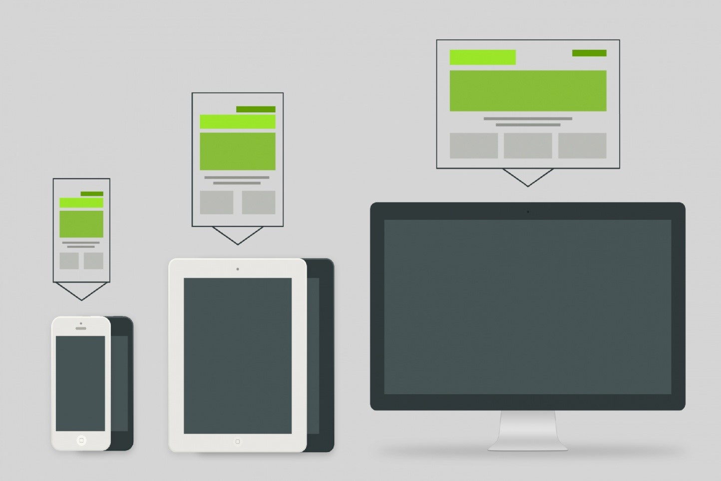
Responsive web design is often the better choice: with a flexible layout and media queries, the website adapts dynamically to different screen sizes, which makes development and maintenance easier and brings better SEO and a consistent user experience. Adaptive web design, in contrast, means creating fixed layouts for different sizes. That can help optimize performance for specific devices, but it is more complex and less flexible. Given the variety of devices, responsiveness is usually the more sustainable and efficient approach.
Conclusion
Choosing between responsive and adaptive design is a strategic decision that should take into account your business goals, your budget and, above all, the needs and behavior of your target audience. Offering a flexible, cost-effective and future-proof solution, responsive design is often the preferred choice for many projects. Adaptive design, with its finer control over the user experience on different devices and better performance on specific ones, can be the more suitable option for large, complex websites with custom needs.
If you’re unsure which approach is right for your website, or you’re looking for an expert team to build a professional website tailored to your needs, Karzaan, drawing on up-to-date knowledge and the experience of its specialists, is ready to offer expert advice and high-quality web design services. To learn more and start working together, get in touch with Karzaan.